gm gm!
We're back and we've got some pretty major updates to share just in time for our Epoch 5 Allocation Window.
🗓 But first, some important dates for you:
- Epoch 5 Allocation Window (AW) opens on October 13th at 6 PM CEST (9 AM PDT / 12 PM EDT)
- Allocation Window closes: October 27, 2024, at 5 PM CET (9 AM PDT / 12 PM EDT)
- You can personally withdraw rewards, donate (and get matched as high as 61x) or do both (hell yeah to doing good and doing well). Just keep in mind inaction during AW will lead to your user rewards wasted for the epoch.

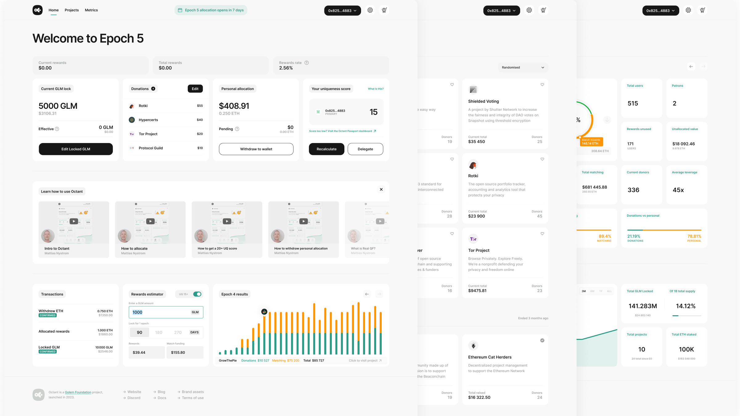
As the Epoch 5 Allocation Window opens you'll notice the Octant Application looks different. That's because it's been shipping season at Octant and we've got a new look and key features on our app.
As we work towards more transparency, we want to give you a closer look into our development process. That's why we want to share the thought process behind these changes, and more importantly what that means for you, as a user. Moving forward, you can expect updates on an ongoing cadence closer to our epoch windows.
We also want to take a moment and start with a major thank you to our community and users. These changes would not have been possible without so many of you making time to give us feedback. Filling out surveys, participating in interviews, and engaging with our team– your thoughtful feedback and engagement has been invaluable. It's a core part of our product development process, and we look forward to continue learning from you!
PS, if you're interested in participating in compensated user interviews moving forward, fill this and we'll get in touch.
🥁 Now the updates

Epoch 5 brings three major updates focusing on improving the usability and donor experience of the application.
- A brand-new desktop UI, designed with insights from our recent user survey.
- A new reporting display, designed to aid donors in making informed allocation decisions.
- An updated anti-Sybil process, improving user experience while maintaining the integrity of our community funding mechanism.
💚 Changes in the UI
In spring 2024, we conducted a user survey, gathering a wealth of helpful comments and suggestions on how the app could be improved. While most participants were generally happy with the overall user experience, they also shared valuable ideas for improvement, some of which are mentioned below.
I always forget I have to heart a project on the Projects page for it to show up on the Allocate page
I found it difficult to understand how everything worked and the steps i should follow
I have a monitor that's so wide I could easily see all the projects without having to scroll if the UI was responsive.
A clear theme running through the feedback was the lack of a proper responsive desktop UI. We originally built the app quite quickly and a proper responsive UI that worked well at various sizes of desktop browser wasn’t viewed as essential. Rectifying this was the main aim with this update, but we also took the opportunity to address other UX concerns.
So what has changed on the app?
There are now 3 main views: Home, Projects and Metrics.
💰 Allocate becomes a side drawer you can open from any view via the shopping cart icon at top right. Add some projects and see the badge on the cart icon update. Settings is also a side drawer now.
📅 Key dates calendar now lives in the menu bar, showing the current or next key event, just click to see all upcoming key dates.
Projects and Metrics haven’t changed much in this iteration, though personal metrics have been moved to Home, which is where the main changes are.
🏠 Home view replaces the old Earn view and gathers all key features into one place; Lock, donate, withdraw & UQ are all right at your fingertips now. The Donate tile is new. During allocation it will show your current donations, and outside allocation allows you to see your donation history. It also gives you a shortcut to edit your donations.
💡 The Learn bar is also new. Here you’ll find a range of short videos including a Quickstart guide, and a walkthrough for each key feature of Octant: locking, verifying, donating and withdrawing.
💲 The Rewards estimator is now front and centre instead of hiding behind an icon on the Lock tile. Quickly see how much you might earn for any locked amount over 1, 2 or 3 epochs.
📈 There is also a new interactive chart showing live results for all projects during allocation, or the final results of the previous epoch outside of allocation. Mouse over any bar to see the project’s info and metrics. Click to open that project’s detail page to easily donate to them.
We've integrated with Karma GAP
One of the key insights we gained from the user survey is the community wants to be better informed about the impact of their donations. You’ve expressed interest in receiving updates on project progress, including project milestones and their progress towards meeting them, what other sources of funding they have beyond Octant Epoch funding, and the overall impact they are having.
In response to this feedback, we've integrated with Karma GAP to bring this information directly into the hands of donors. Moving forward we will be pulling milestone data from Karma Gap and displaying it directly to users via the Octant app. Furthermore, we have redefined our reporting requirements and all of this new information will be accessible via each projects Karma Gap profile.
Enhanced Sybil Resistance
TL;DR:
- Gitcoin Passport score requirement lowered from 20 to 15 points.
- GTC staking stamps removed from score calculation.
- Expanded allowlist for automatic maximum matching.
- Most users no longer need to interact with the Gitcoin Passport dashboard.
- Time-out list introduced for suspected Sybil accounts.
Improving Our Uniqueness Quotient System
In Epoch 4, we transitioned to quadratic funding and introduced the Uniqueness Quotient (UQ), based on Gitcoin Passport, to ensure a fair distribution of matching funds. While this was a crucial step in maintaining the integrity of our system, we recognize that it posed some challenges for some community members.
Based on your feedback, here’s what we learned about our Gitcoin Passport integration:
- Difficulty for newcomers: Some users, especially those new to web3, found it hard to gather enough stamps to reach the required 20 points.
- External service interaction: Many users felt that interacting with our custom Gitcoin Passport dashboard was inconvenient and, in some cases, raised privacy concerns.
- GTC staking concerns: Some viewed the inclusion of GTC staking stamps as unfairly favoring the Gitcoin community without enhancing Sybil resistance.
- Complexity for experienced users: Even for those familiar with web3, the process sometimes felt unnecessarily complicated.
We’ve carefully considered this feedback and are excited to announce several key improvements for Epoch 5 that will make participation easier and more inclusive while safeguarding the integrity of the system.
Key Improvements:
- Lower score threshold: Based on our community Snapshot poll, we've reduced the required Gitcoin Passport score from 20 to 15 points. This change makes it significantly easier for newer web3 users to qualify for maximum matching.
- A simpler verification process: We've reduced the need for direct interaction with the Gitcoin Passport service. Most users won't need to engage with the Passport dashboard at all.
- Expanded allowlist: We've extended our allowlist to include all non-Sybil accounts from the previous allocation window and all new users from our recent community-building initiatives. If you're on the allowlist, you'll automatically receive 21 extra Passport points guaranteeing maximum matching for your donations without any additional steps.
- Fairer calculation: We've removed GTC staking stamps from the UQ score calculation. This creates a more level playing field and addresses concerns about favoring specific communities.
- Enhanced Sybil resistance: To maintain system integrity while lowering barriers, we've partnered with the Gitcoin Passport team to conduct Sybil Account Detection on all Octant GLM-locking addresses. This analysis will flag any GLM-locking addresses suspected of belonging to the same owner, preventing attempts to unfairly influence fund distribution.
🚨 So what does this mean for you?
- Allowlist Members: If you're on the allowlist, you're all set! No further action is needed to ensure maximum matching.

- New or Returning Users: Check your UQ score in the Home view of the app. If your score is below 15, the app will guide you to Octant’s Gitcoin Passport Dashboard, where you can add extra stamps. Here’s a helpful guide from the Passport team to assist you in this process.
- Sybil Detection: Any addresses flagged by the Gitcoin Passport team as suspected Sybils will be placed on a time-out list for this allocation window. Their UQ score will be set to 0, and donations from these accounts will not receive matching. Users on the time-out list can dispute their placement and re-verify their accounts, though changes will only take effect in the next allocation window.

We believe these changes strike the right balance between accessibility and security. By simplifying the process for most users and creating clear pathways for new participants, we’re making it easier for everyone to fully engage with Octant.
After careful consideration of available options, we’ve decided to continue using Gitcoin Passport, albeit with significant modifications. It remains the most robust anti-Sybil tool in the web3 space. However, we’re committed to continually evaluating and improving our processes based on your feedback and evolving best practices.
If you have suggestions for further enhancing the user experience or preserving the integrity of the fund allocation process, please reach out to us on Discord, the Discuss forum, or our social media channels (Farcaster, Twitter/X). After this allocation window closes, we will continue to closely listen to feedback through interviews, user surveys, and efforts to learn more from your experiences.
Thank you for your time, your engagement, and your participation in our community!
The Octant Product Team.


